Context
uCredit is a degree-planning web app built by a student team at Johns Hopkins: students plan courses against degree requirements, share plans, and invite reviewers to comment. I started as a UX designer and became UX program manager.
I spent a full quarter on user research: contextual inquiry, usability testing, user-flow mapping, and affinity diagramming. That research set the next quarter's work. I then led every sprint, hired three designers, ran weekly standups and retros and one-on-ones, built the roadmap, and worked with the engineering leads and the founders.
Constraints
- The designers were part-time, early-career students juggling full course loads, so I wrote learning materials for them and ran one-on-ones.
- There were no product analytics at all. I worked with an engineer to build them.
- Each project was scoped at roughly 2 to 20 hours of work.
Problem
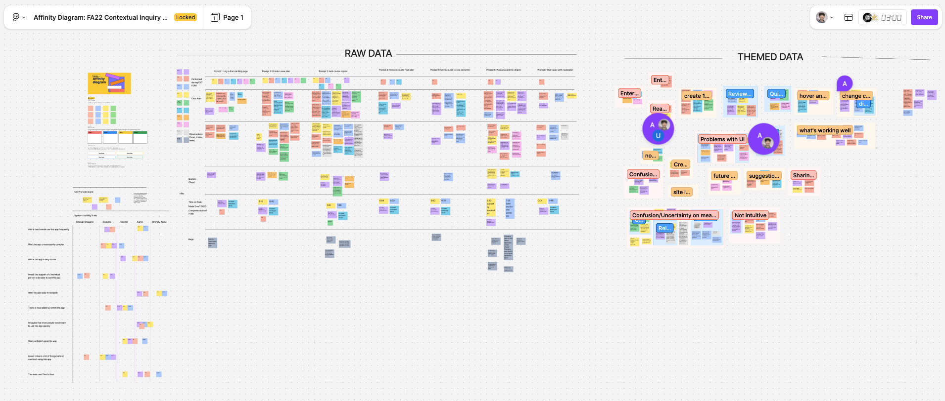
Affinity mapping of the research produced 16 themes with observations and insights, and it pointed at real problems: layouts overlapped when a window was resized; typography, color, and components weren't standardized; the add-course button was small and greyed out, so newer users struggled to find it; users couldn't tell the reviewer and share features apart; commenting was basic and looked dated; and the reviewer dashboard had seen far less research than the main planner.
New users also had no guide to the features that did exist.
North starProjects shipped per quarter, with the research findings closed out one by one.
Decisions
Order the work by dependency
- Options
- Starting on the most visible redesigns, or on the foundations.
- Evidence
- Seven scoped projects, some blocked on others: the design system feeds everything, and the tutorial can't be written until the features it teaches are settled.
- Chose
- Responsiveness first (top priority, handed to developers as soon as it was done), then the UI kit, then the feature redesigns, then the tutorial last.
- Didn't build
- Responsive layouts for very large screens like TVs.
- Cost
- The onboarding tutorial, which new users needed most, waited on three other redesigns.
Fix the share/reviewer confusion by merging
- Options
- Keeping the two buttons and improving labels, or combining them.
- Evidence
- In usability testing many users couldn't tell reviewer from share, though a minority did it right.
- Chose
- Start from merging them into one entry with sub-options (by JHED, by link) and workshop the wording of 'by link'.
- Didn't build
- Two separate buttons with clearer labels.
- Cost
- One button now carried two ideas, so its wording had to do more work.
Diagnose before redesigning the add-course button
- Options
- A visual fix, or a change to the flow.
- Evidence
- In interviews, users found the button small and greyed out.
- Chose
- First decide whether it's a UI problem or a flow problem; then raise contrast and size, and redesign the flow if needed.
- Didn't build
- A bigger button without checking why people missed it.
- Cost
- Extra scoping time on what looked like a small fix.
Hire designers and give each a project
- Options
- Doing the ten projects myself or growing the team.
- Evidence
- The quarter's scope was far larger than one person could do.
- Chose
- Hire three designers, give each project a single owner, and support them with learning materials, weekly one-on-ones, standups, and retros.
- Didn't build
- A larger, less-supervised team.
- Cost
- Time spent coaching early-career part-timers instead of designing.
Solution
We shipped ten projects in the quarter: six redesigns (add course, share and export, commenting, reviewer dashboard, plan renaming, and the notification summary), two new designs including the new-user tutorial and onboarding flow, one motion design (the logo), and web-app responsiveness.
Outcome
The team completed 10 projects in one quarter, and project completion rose 400%. Separately, the site redesign was followed by a 450% increase in total accounts within two months.
Because analytics didn't exist before this work, I can't tie each redesign to a change in user behavior.
Do differently
- Put analytics in before the redesigns, so each project has a before and an after.
- Ship fewer, larger projects. Ten projects of 2 to 20 hours each is a lot of small releases to track.
- Write the designer onboarding materials once, up front, instead of building them as new people joined.